visual work
Graphics
Brand identity, campaign systems, merchandise, and visual storytelling work built for organizations and products that need to look as intentional as they feel.
Viet Career Conference 2026
Campaign + MerchViet Career Guide · 501(c)(3) nonprofit · 2026
Designed campaign and merchandise visuals for VCG's annual conference, applying a consistent identity across promotional graphics, T-shirts, and tote bags.
Brand System
VCG Logo Lockup
Viet Career Guide
Color Palette
Primary
Secondary
Typography
Aa
Anton · Display
Aa
Inter SemiBold · Headlines
Body text for clarity and warmth.
Inter Regular · Body
Deliverables
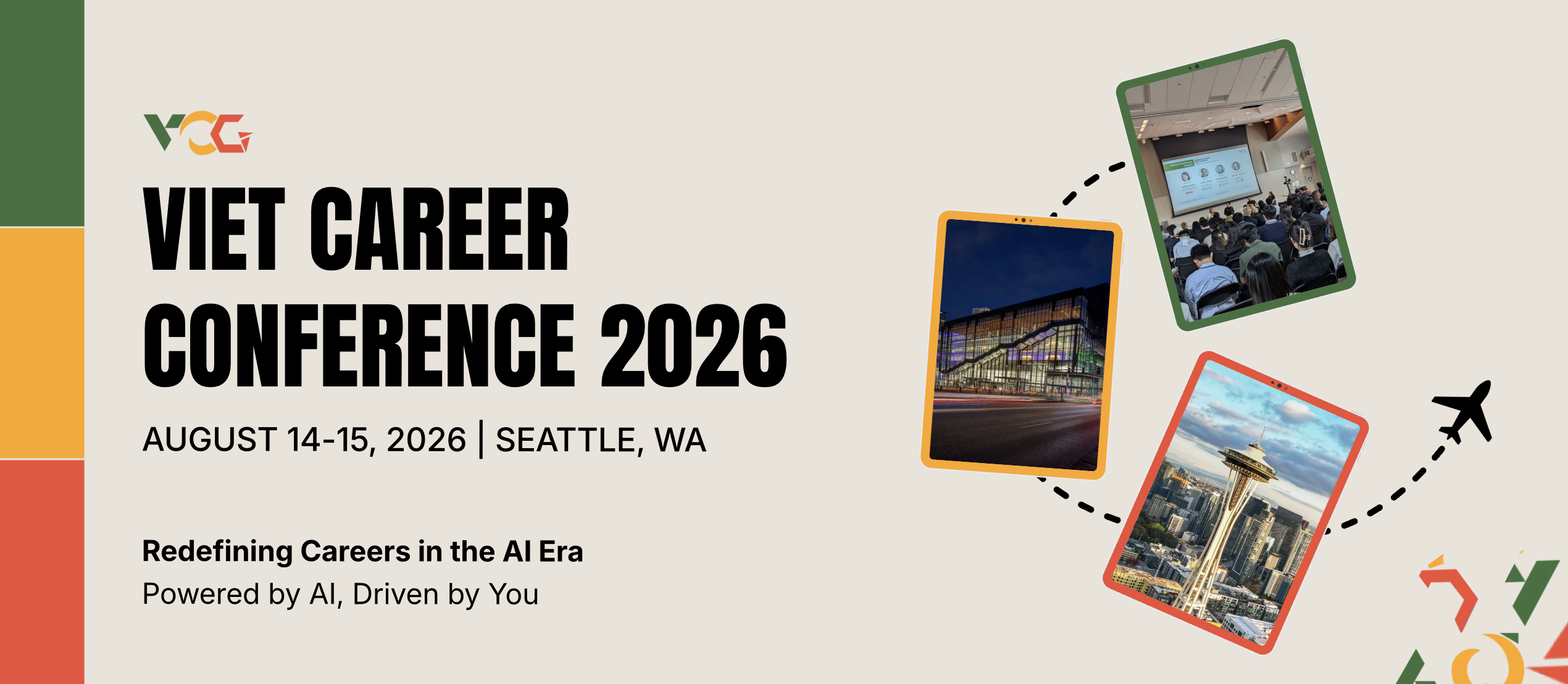
VCC 2026 Main Event Graphic - Conference hero banner with VCG brand identity
Main event graphic - conference hero banner
VCC 2026 Event Promo - Date, location, and call-to-action graphic
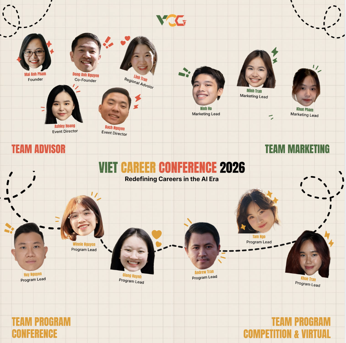
Team Leads Post
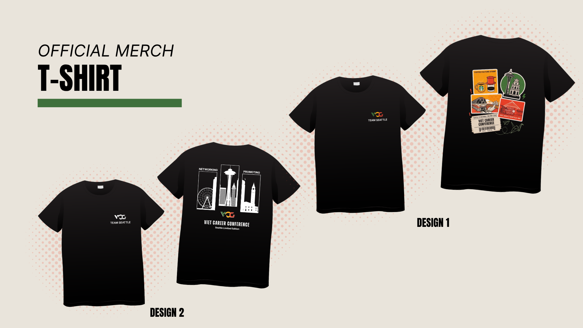
T-shirt designs
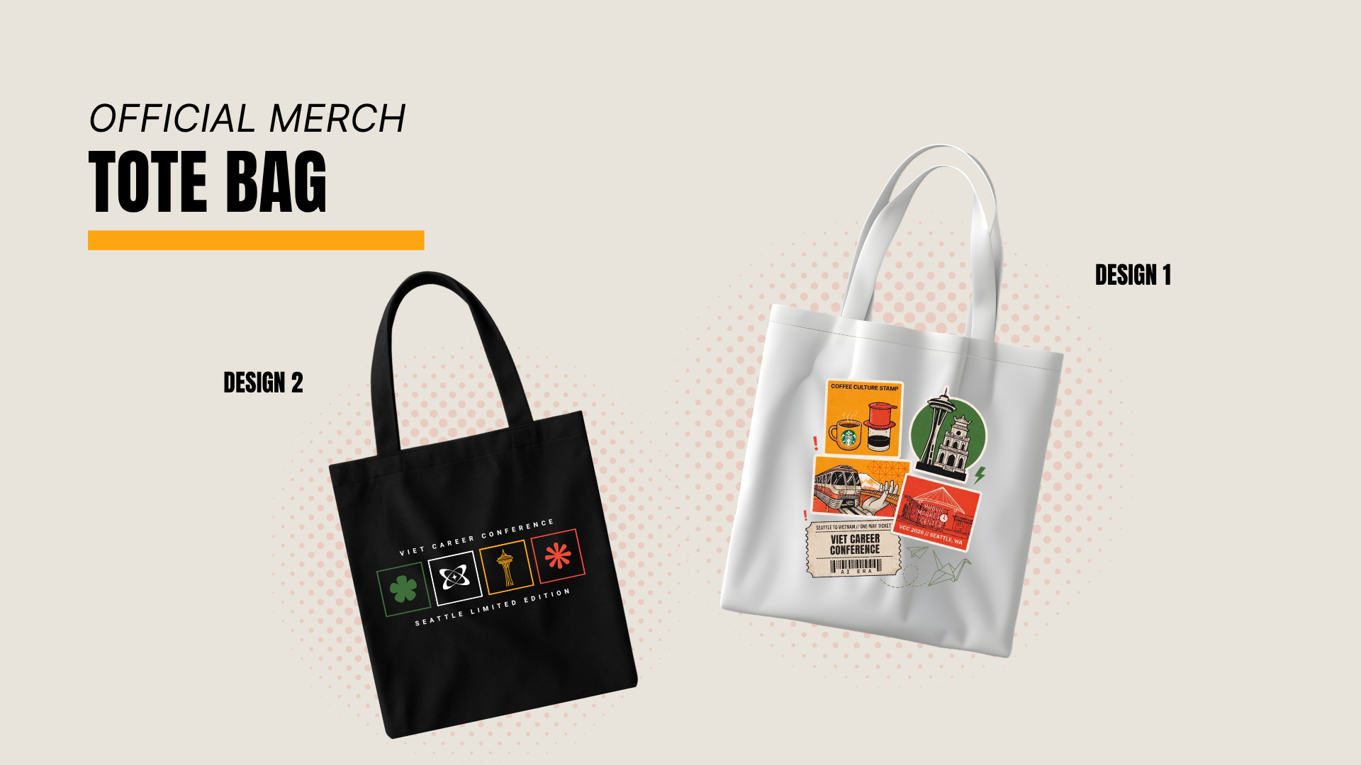
VCC 2026 Tote Bag - Canvas bag merchandise with conference branding
Tote bags
Juimy
Brand + PackagingFresh Juice Startup · Brand Identity · 2025
Full brand identity for a fruit juice startup, logo system, color palette, typography, and packaging design that communicates freshness and playful energy. A small uniform application extends the brand into a retail environment.
Brand System
Juimy Logo
Fresh Juice Co.
Color Palette
Primary
Secondary
Typography
Aa
Knicknack Regular · Display
Aa
Gliker Black · Display Heavy
Body text, fresh, clean, and easy to read across all touchpoints.
Bahnschrift · Body
Key Visuals
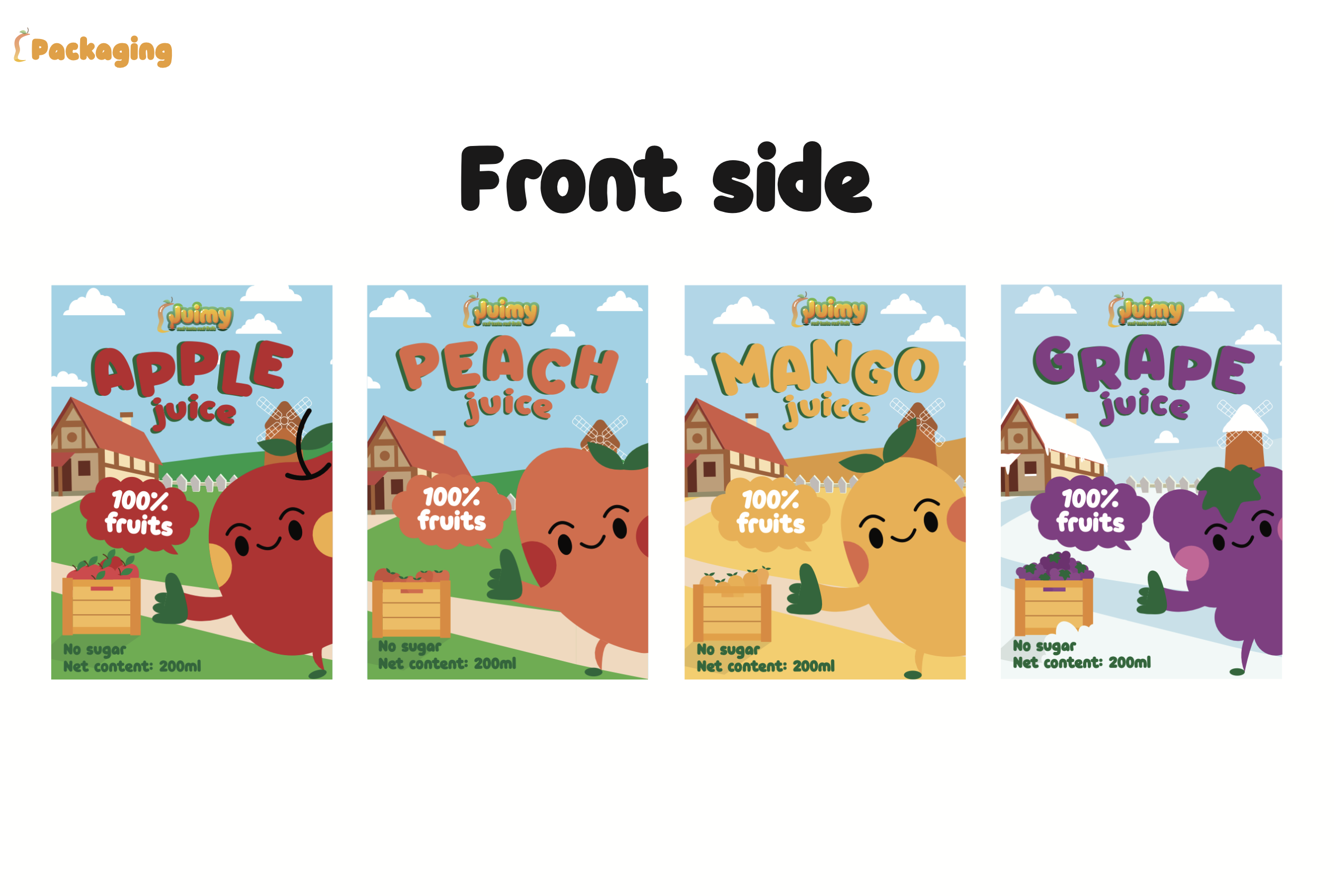
Juimy Packaging Front Lineup: Four juice bottles with brand identity applied
Packaging Lineup: Front-facing bottle collection
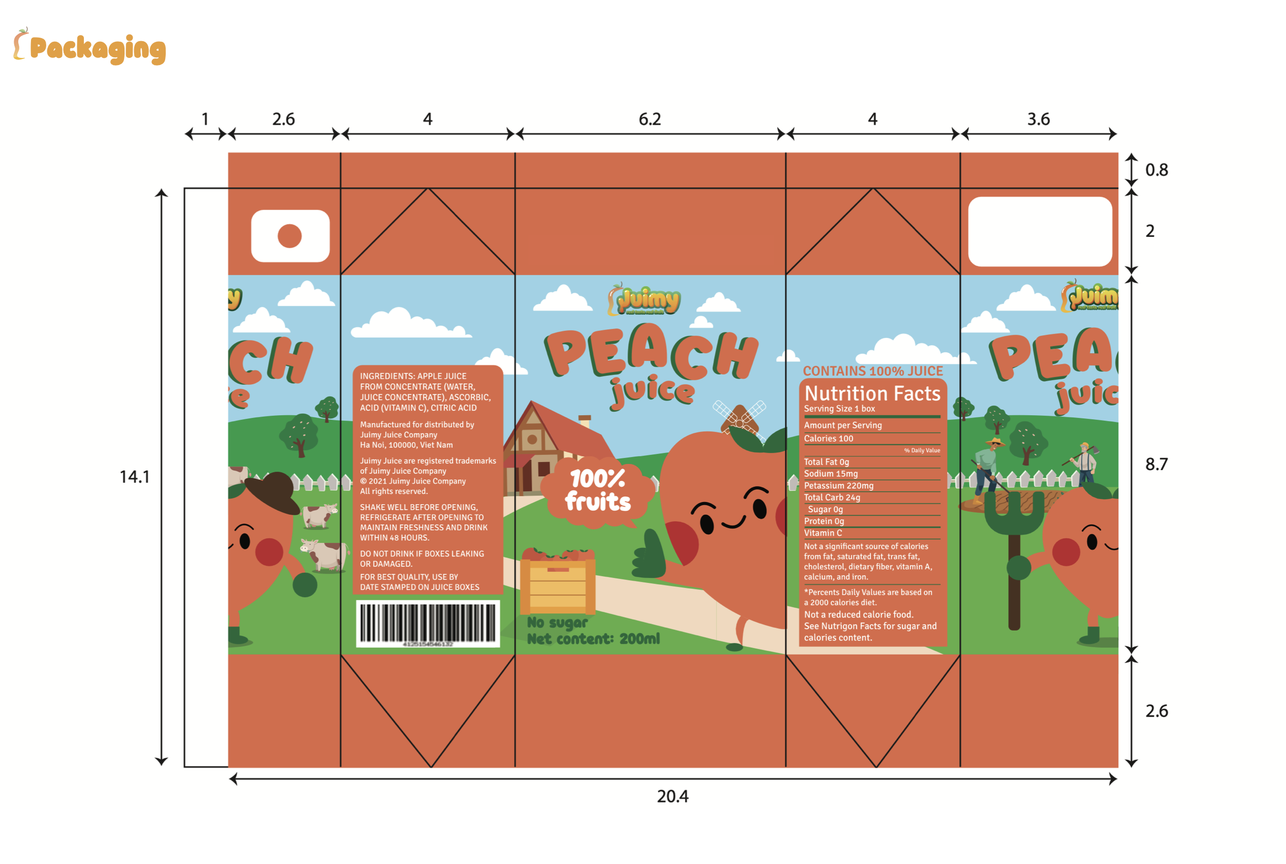
Juimy Packaging Flat Layout: Top-down view of bottles, caps, and branded tags
Packaging System: Flat lay components
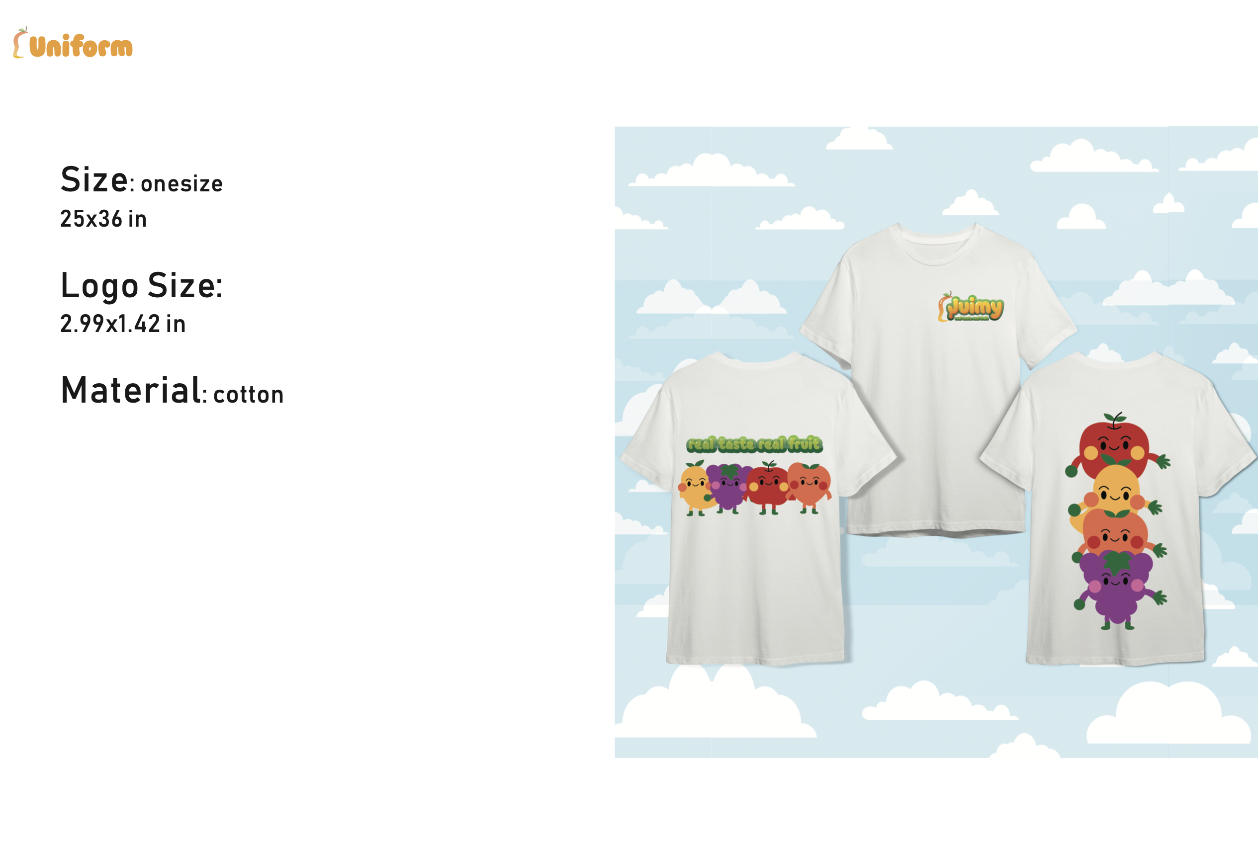
Juimy Uniform Mockup: Staff apron with brand mark application
Staff Uniform: Brand application
Greencity
Logo ExplorationA sustainability-focused identity study exploring how a bold geometric “G” letterform can evolve into softer organic motifs. Four directions blend angular structure with animal-inspired symbolism, Hawk, Fish, Bird, and Panda, each balancing precision with natural fluidity to find the mark that best communicates environmental stewardship.
Logo Exploration
Four directions developed around the “G” letterform, each drawing from a different animal archetype to explore how geometric precision meets organic movement within a sustainability-driven brand identity.
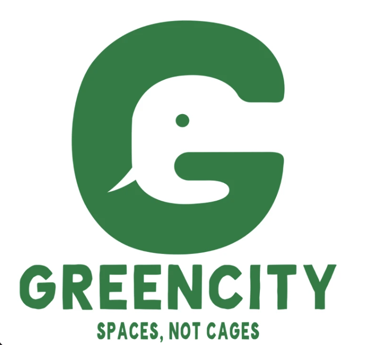
Greencity Logo Exploration: Hawk direction, "G" letterform with animal-inspired organic motifs
Hawk
Sharp angular wings emerging from the G form, conveying vision and precision.
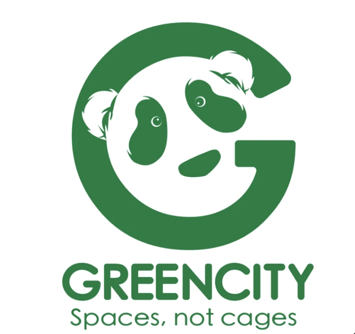
Greencity Logo Exploration: Fish direction, "G" letterform with animal-inspired organic motifs
Fish
Flowing curves and fin-like serifs suggesting water, flow, and ecosystem balance.
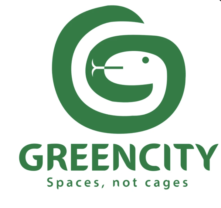
Greencity Logo Exploration: Bird direction, "G" letterform with animal-inspired organic motifs
Bird
A lighter, open-breasted silhouette, flight, freedom, and upward momentum.
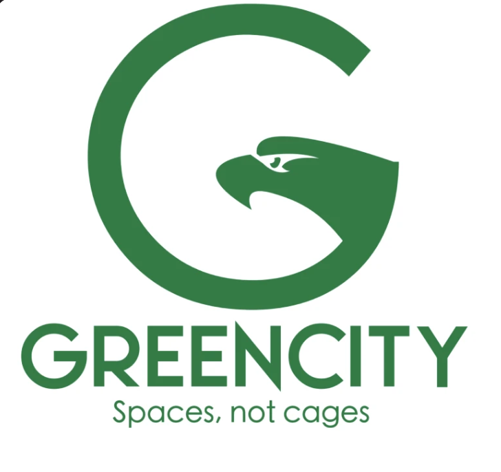
Greencity Logo Exploration: Panda direction, "G" letterform with animal-inspired organic motifs
Panda
Rounded, friendly geometry with subtle ear forms, approachable and grounded.
LUMI
Poster / PromoA supporting poster and promotional concept piece exploring layout, typography, and composition. Designed as a visual study in hierarchy and negative space, balancing bold type with restrained color to create immediate impact.
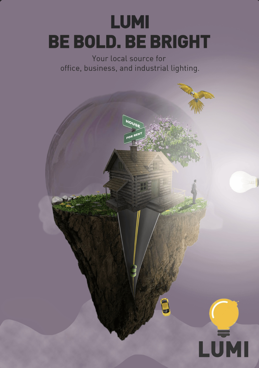
LUMI Poster: typography and composition study