Context / Business Goal
Why this study mattered
The Celtics wanted to understand how official waitlist experiences shape fan trust, engagement, and purchase intent when tickets are unavailable. To benchmark what works and what breaks, we compared the waitlist journeys of three competitor organizations.
Rather than auditing their own product in isolation, the goal was to identify patterns across the industry, surfacing both best practices and systemic gaps that informed targeted recommendations.
🎯 Increase conversion
Identify barriers preventing fans from completing the waitlist sign-up process.
🤝 Build fan trust
Surface messaging and UX patterns that help fans feel confident and informed.
📊 Competitive benchmarking
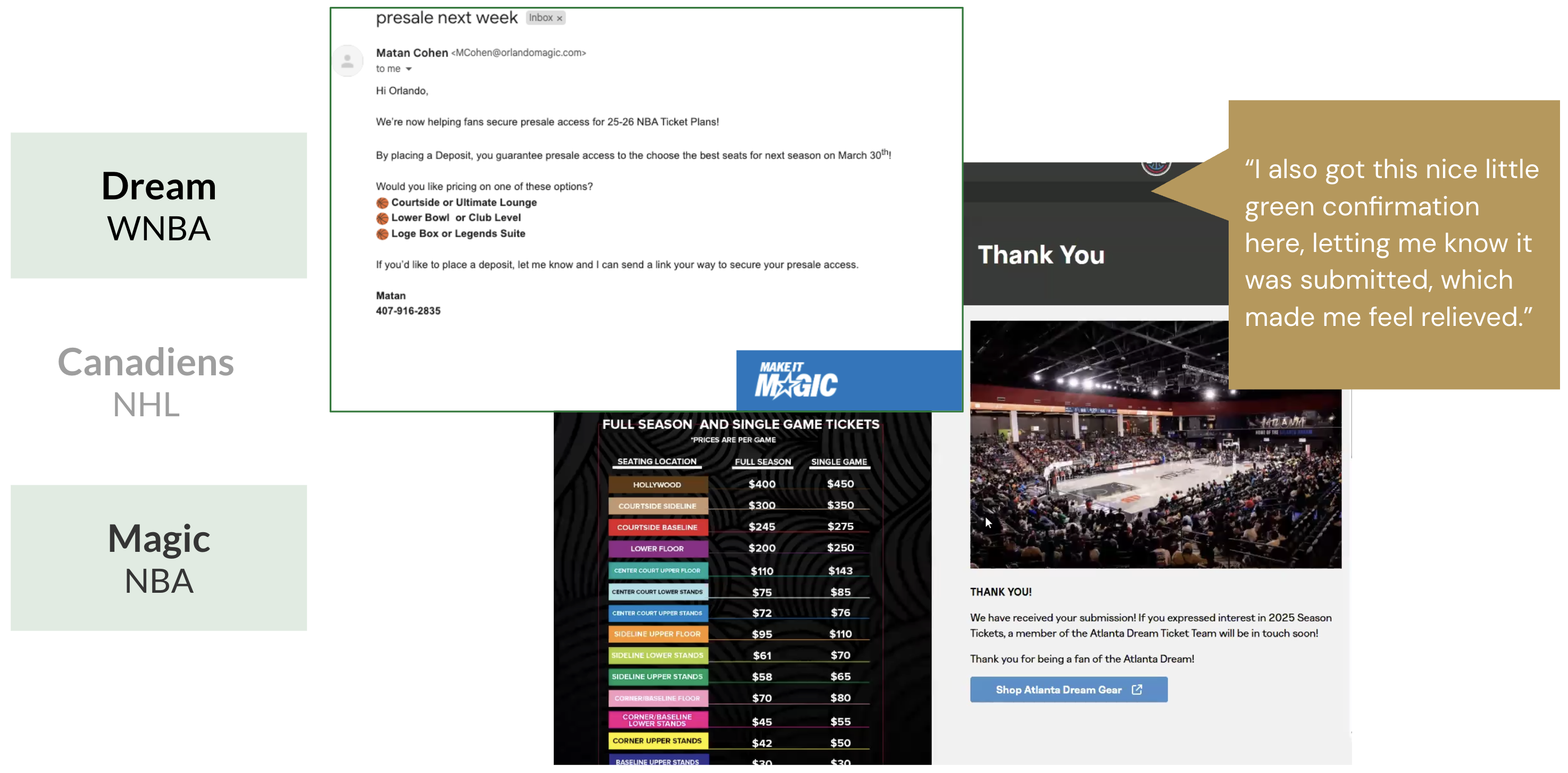
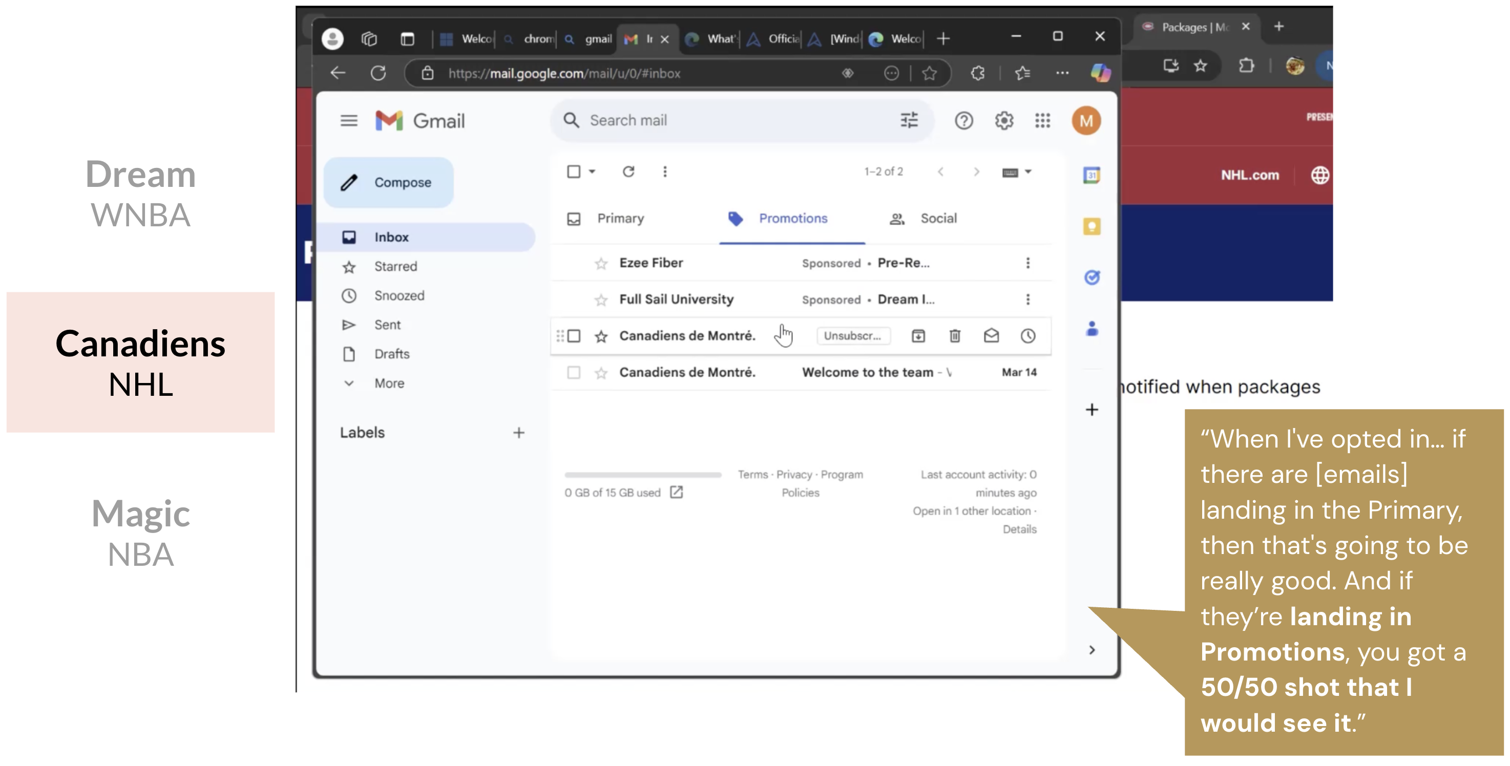
Analyze 3 competitor waitlist flows - Atlanta Dream, Montreal Canadiens, Orlando Magic - to extract best practices.
Problem / Research Question
How fans think about waitlists before we even started testing
Before testing, we wanted to understand how fans thought about waitlists in the first place. Many participants said their first instinct after seeing sold-out tickets was to check resale platforms like StubHub.
They saw official waitlists as more trustworthy, but only if they offered clear confirmation, updates, and visibility into what happens next. Without those signals, the official path felt no more reliable than a third-party reseller.
Research Question / HMW
How might official team waitlists feel like a trustworthy, worthwhile alternative to resale platforms?
Teams benchmarked

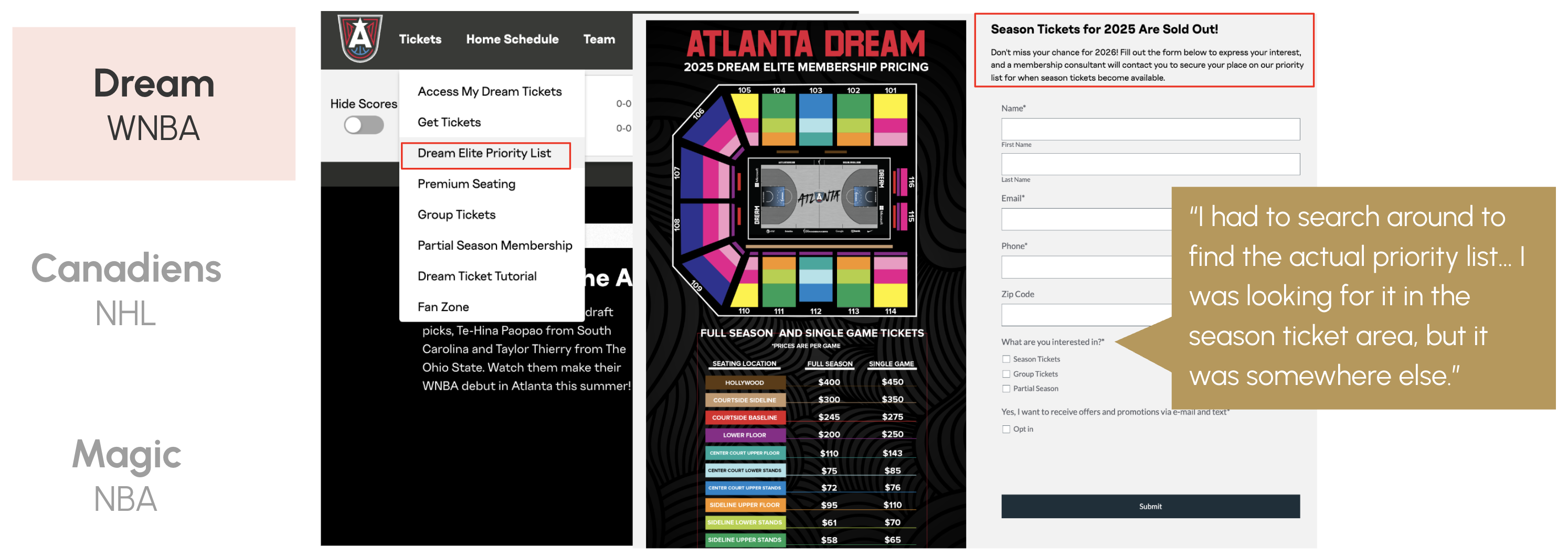
Atlanta Dream
Simple form, low friction

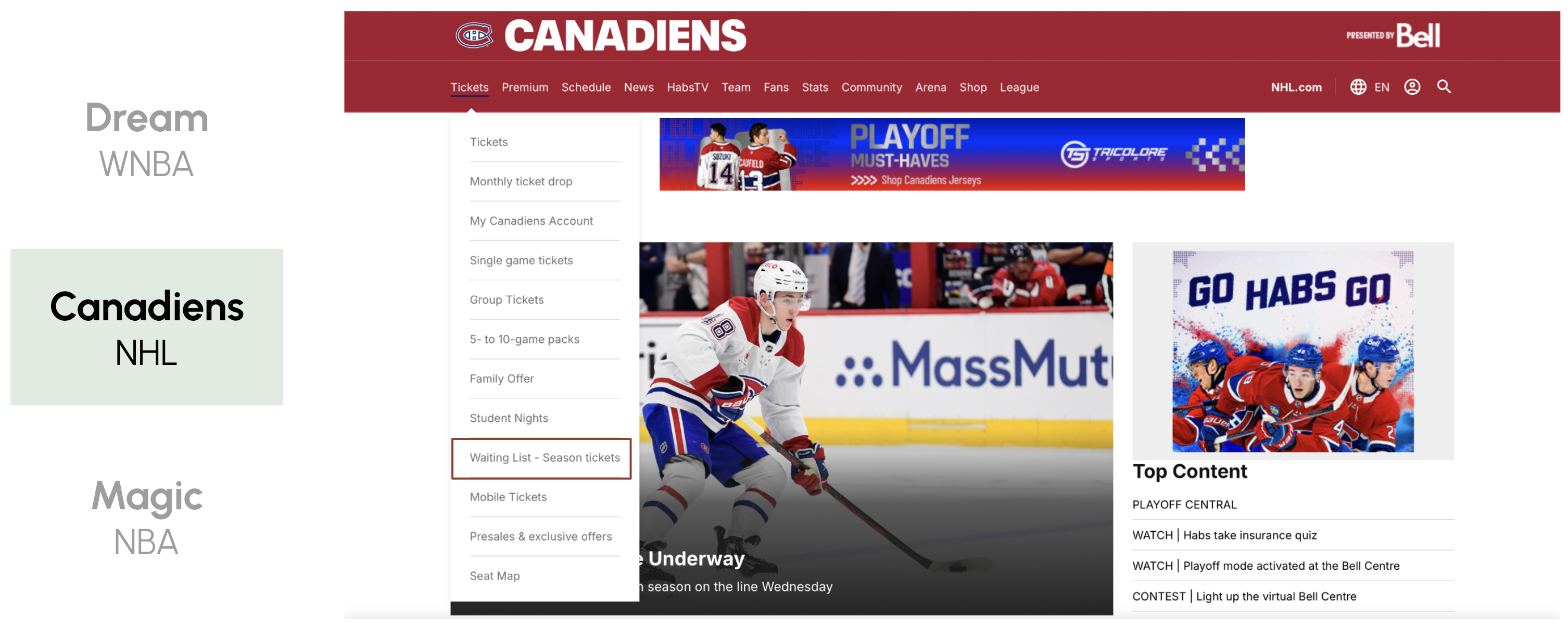
Montreal Canadiens
Clear navigation placement
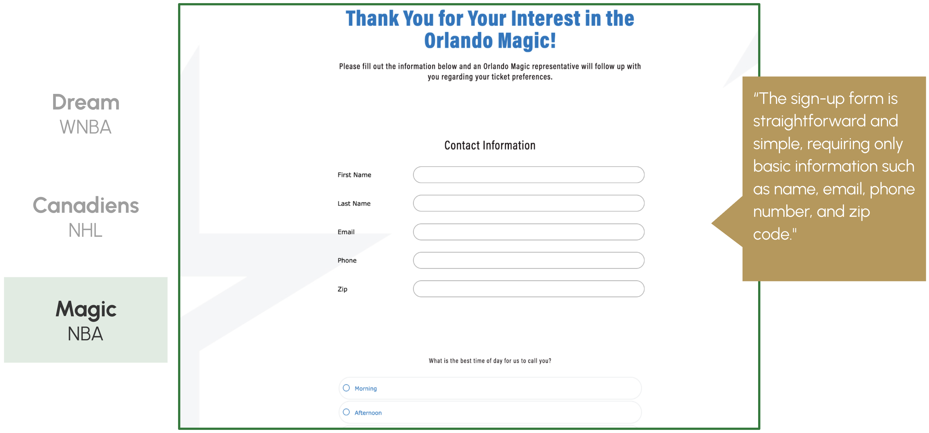
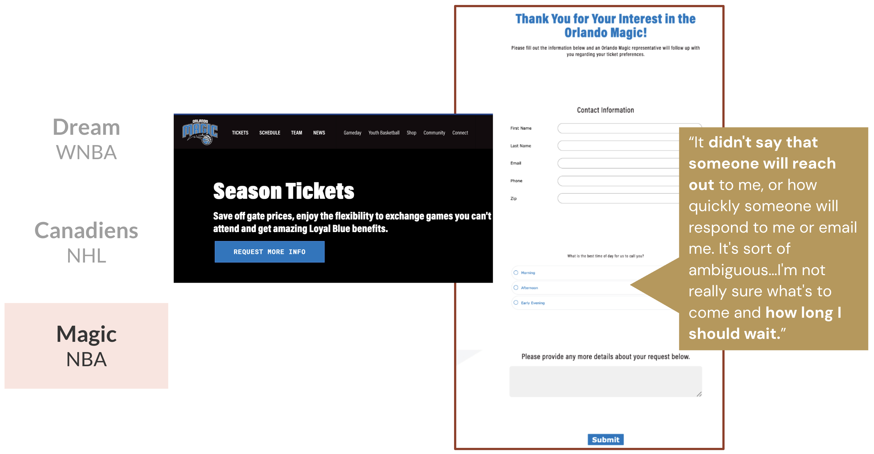
Orlando Magic
Post-submission uncertainty